Status box
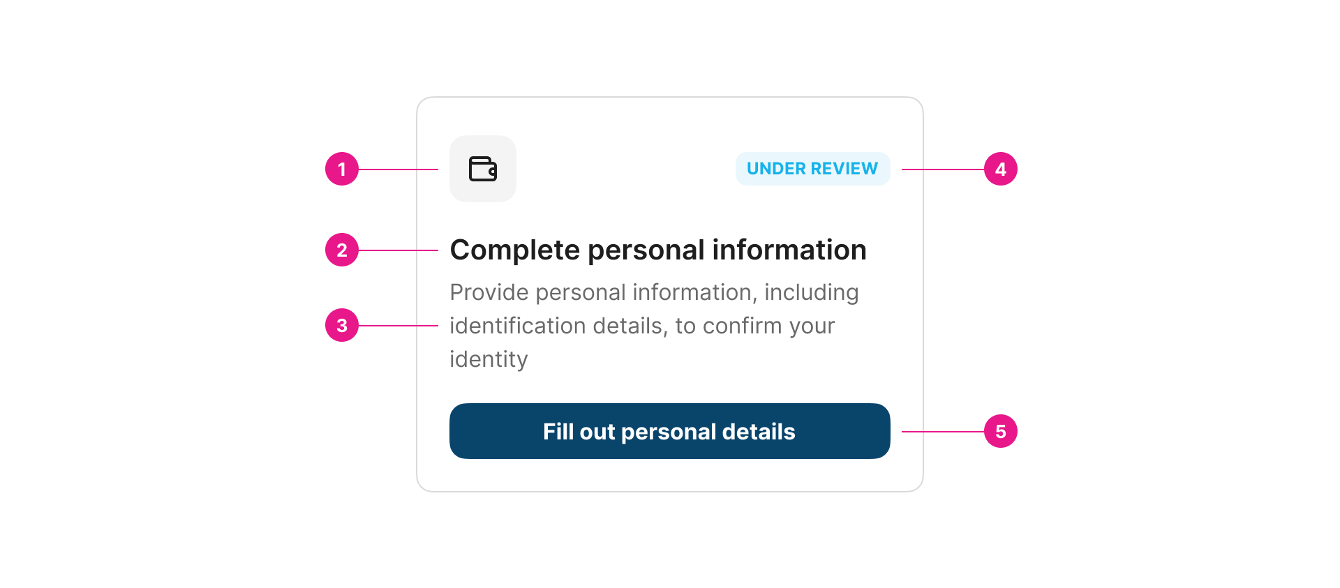
A status box displays task steps and the current status of a process. It helps users track progress and allows them to navigate between completed and pending tasks.

Properties
Value "expression" | required
The binding for the component. Use an appropriate expression to bind the component to its value and specify where the value is saved/read.
For example, use
'{{myVariableName}}'to store the value of the component in a variable named'myVariableName'
Use prefixes to define the scope of the value.
For example,
'root.'for referencing the root case to store the value in or'parent.'to store the value in the parent work item of the current one.
Please refer to the section 'Frontend expressions' in the Flowable guide for more information.
Expression "string", "variable", "expression"
The expression which will be executed to save the result into the button value.
Title "string", "variable", "expression" | required | multilanguage
Descriptive short title for the status box.
Description "string", "variable", "expression" | required | multilanguage
The description attribute adds a description to the component.
Icon "ENUM" | required
Icon to give more context to the status box.
Status value "string", "variable", "expression"
Value to identify the status of the box.
Status mapping "table"
Map the status value with the corresponding status variant and label.
| Name | Type | Description |
|---|---|---|
| Status value | "string", "variable", "expression" | Value to match with the component status value. |
| Status label | "string" | multilanguage | Label for the value. |
| Status variant | "ENUM ("success", “info”, “warning”, “danger”, “neutral”, “grey blue”, “vermilion”, “orange”, “grass”, “brownie”, “sky”, “purple”)" | Variant for the value. |
Dynamic button "boolean"
Show or hide different properties related to the button to make its content dynamic or not.
Button text "string", "variable", "expression" | multilanguage
This property appears only whenDynamic button property is false.
Replace the default action button text with this (leave blank to use default action name).
Button variant "ENUM ("primary", “secondary”, “accent”, “critical”)"
This property appears only whenDynamic button property is false.
Replace the default action button variant with this. Leave blank to use default action variant (primary).
Button mapping "table"
This property appears only whenDynamic button property is true.
Replace the default action button with this table button name and variant according to the status. Map the status value for the button.
| Name | Type | Description |
|---|---|---|
| Status value | "string", "variable", "expression" | Value to match with the component status value. |
| Button label | "string" | multilanguage | Label for the button. |
| Button variant | "ENUM ("primary", “secondary”, “accent”, “critical”)" | Variant for the button. |
Margin top "number"
Add space equivalent to the number of indicated pixels to the top margin.
Margin bottom "number"
Add space equivalent to the number of indicated pixels to the bottom margin.
Margin left "number"
Add space equivalent to the number of indicated pixels to the left margin.
Margin right "number"
Add space equivalent to the number of indicated pixels to the right margin.
Tips
This component is supposed to be used on a grid. Therefore, the description property must have a height of three (3) lines so the components are not misaligned when they are shown together.
Updated about 1 year ago
