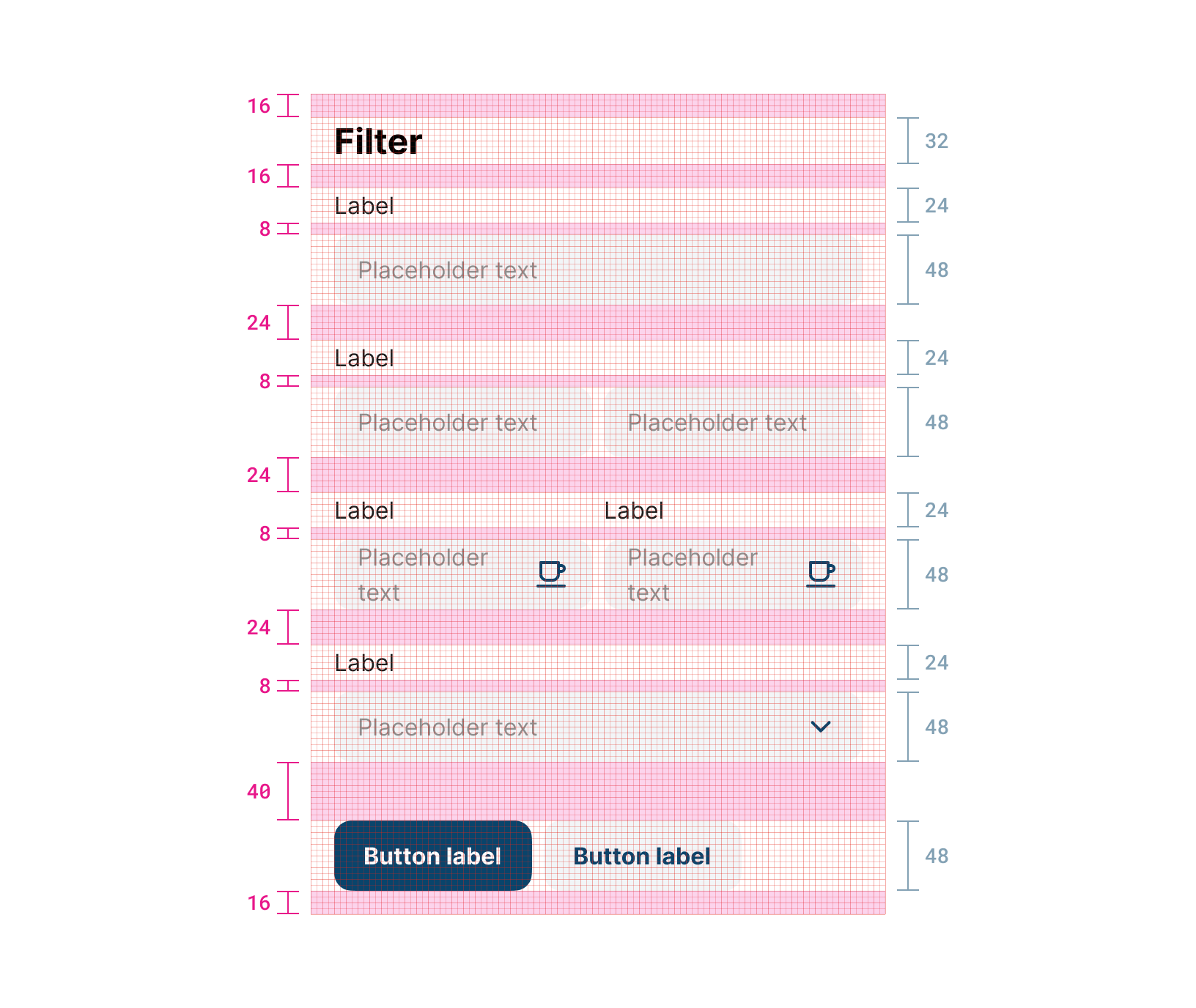
Spacing container
Used to add margin by pixels to adjust the alignment of other components.

Properties
Margin All number
Add the number of pixels required to add spacing on each one of the margins.
Margin Top number
Add the number of pixels required to add spacing (margin) to the top.
Margin Right number
Add the number of pixels required to add spacing (margin) to the right.
Margin Bottom number
Add the number of pixels required to add spacing (margin) to the bottom.
Margin Left number
Add the number of pixels required to add spacing (margin) to the left.
Modal Button Text string
Text to show as the button to open the modal.
Modal Open string
Simple expression associated to open the modal.
Collapsible boolean
If true, the subform can be collapsed/expanded by clicking on an arrow ▲/▼
Initially Collapsed boolean | !required
If true, the subform will be initially rendered as collapsed.
Show Border boolean | !required
If true, the subform renders a border around the list of elements in it.
Width string | !required
Width of the modal dialog.
Save Button Text string | !required
Text in the submit button once the modal is opened.
Save Button Visible boolean | !required
Whether or not to show the submit button.
Cancel Button Text string | !required
Text in the cancel button once the modal is opened.
Cancel Button Visible boolean | !required
Whether or not to show the cancel button.
Cancel Button Enabled boolean
Whether or not to enable the cancel button.
Updated about 1 year ago
