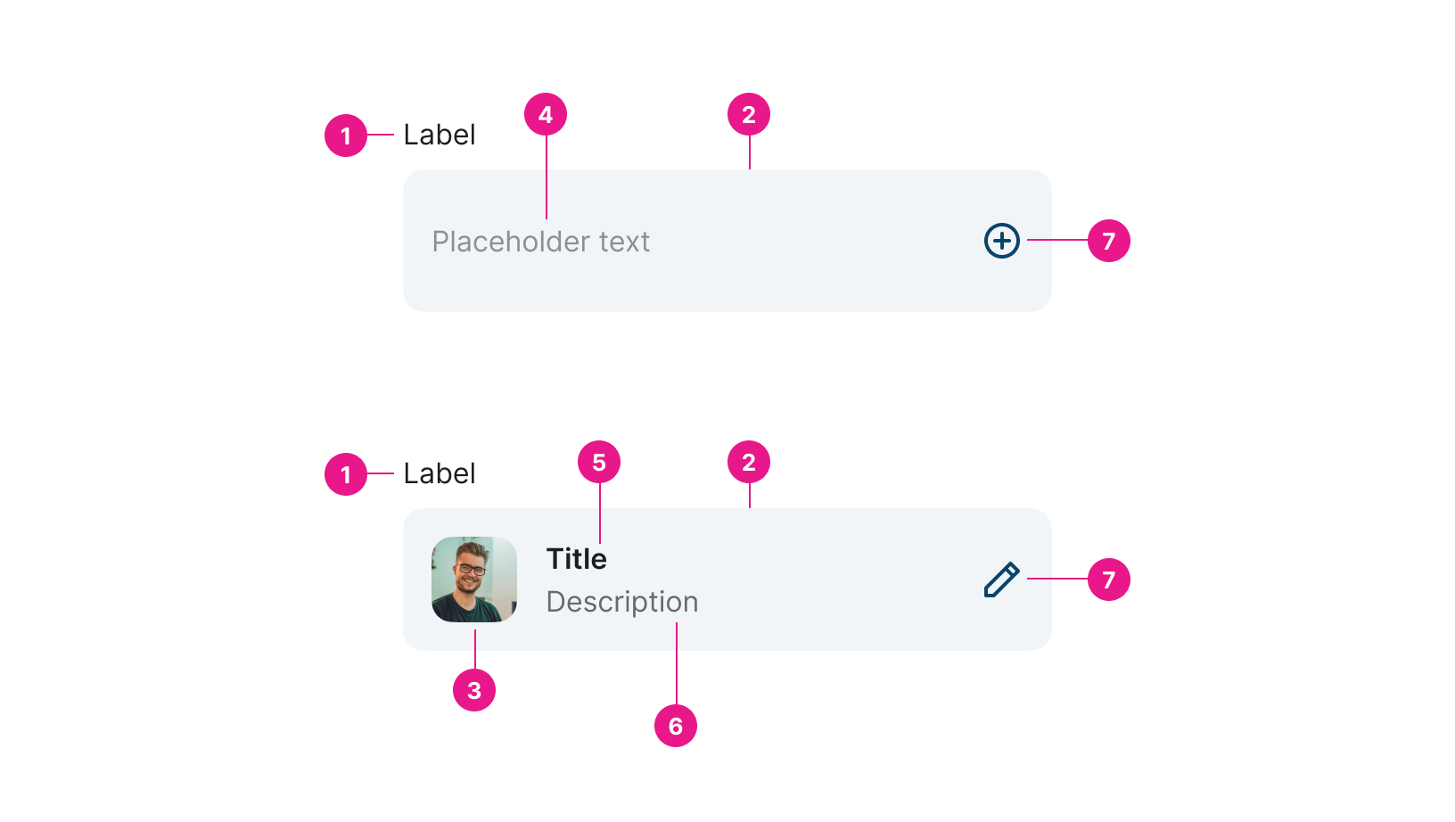
Selector
A form control that shows one or more entities selected from a list.

Properties
Value string | required
Value to handle click status and see if the selector has been clicked and it is open or not.
Value Content string
Add the value content which will be saved on the value property.
Placeholder string
A text that appears in the input box when it has no value.
Label string
The label attribute adds a label to the component.
Clarification string
Type in the clarification text for the end user.
Selector Name string
Name to show in the selector for the end user.
Selector Subtext string
Subtext to show in the selector for the end user.
Selector Description string
Description to show in the selector for the end user.
Selector Avatar Image string
Avatar image to show on the selector for the end user.
Selector Avatar Icon ENUM
Avatar icon to show on the selector for the end user.
Selector Avatar Icon Color string
Avatar icon color to show on the selector for the end user.
Selector Avatar Icon Background Color string
Avatar icon background color to show on the selector for the end user.
Is All Selected boolean
Boolean to show the “is all selected” specific icon on the selector for the end user.
Right Icon ENUM
Right icon to show on the selector for the end user.
Updated about 1 year ago
