Pages and forms
With Toqio Workflow Design, you can directly build forms using drag and drop components then configuring them. You can also implement logic into the form using expressions.
Expressions
Form expressions are "evaluations" or "calculations" used when building forms in Toqio Workflow Design. Form expressions are available in the majority of the attributes used in form components, allowing you to bind components together and define specific form behaviour.
Form expressions are defined using matching double curly braces: **{{** and **}}**, and the payload holds the form data the user has to view or fill in. Expressions are built using values from the payload: literals (numbers, strings, and booleans) and a few special values.
You can use any value from the payload, including literals (numbers, strings, and booleans) and (additional data) inside an expression.
To access attributes of objects you can use the dot operator object.attribute.
To access items in an array you can use brackets array[index]:
{{true}}
{{5}}
{{"hello"}}
{{disabled}}
{{$currentUser.id}}
{{$currentUser.memberGroups.has('workflowsUser')}}
You can use logical operators:
{{!disabled}}
{{age > 5}}
{{length == 5}}
{{length <= 2}}
{{disabled || invisible}}
{{alive && kicking}}
You can use mathematical operators, string concatenation, and conditionals:
{{age + 5}}
{{age - 1}}
{{age / 2}}
{{age * 2}}
{{age % 2}}
Hello {{name}} {{surname}}, have a nice {{dayphase}}
{{name + " " + surname}}
{{age < 16 ? 'child' : 'adult'}}
You can also use Ecmascript methods and attributes of the objects resolved in expressions. For example:
{{case.dueDate.toLocaleDateString()}}
{{tweet.length}}
{{names.join(", ")}}
{{colors.indexOf['red']}}
You can use a pipe operator |>. (It executes the function to its right, passing the parameter from the left side):
{{date2 |> flw.formatTime}}
{{date2 |> flw.formatDate}}
You can use all of them together:
{{user.age + 1 == 21 && !user.admin ? "Next year you can become an admin" : user.admin ? "admin" : "go away " + user.name }}Scope
Input components assign their value into the payload. For example, if a text component has value **{{name}}** when the user writes Jordan in that input, the payload will get an attribute name with value Jordan. The expression in the value attribute of an input component is a special expression that doesn't allow operators.
Most container components, like panels and subforms, also allow you to define a value. This scopes all the values in the components inside the container. For example, you can define this form:
panel: value={{address}}
   text: value={{name}}
   text: value={{number}}
When the user fills in the name with Baker Street and the number with 221B, the payload will become:
address: {
  name: "Baker Street",
  number: "221B"
}
Components can write data to the payload in their scope and their children's scope but not in their ancestors'.
To access and edit data from its ancestors' scope, components can use the special keyword $payload that provides the whole payload. See this complete example:
checkbox: label="Show surname" value={{showSurname}}
panel: value={{client}}
  text: value={{name}}
  text: value={{surname}} visible={{$payload.showSurname}}
In some cases, it is necessary to access the parent scope.
In the following example we want to ensure children are +14 years old when their families don't hire a nursery service. To do that we use the $itemParent keyword to access the parent scope of the component.
subform: value={{families}} [[multipleEntries=true]]
  boolean: label=Nursery service value={{nursery}}
  subform: value={{children}} [[multipleEntries=true]]
number: label=Age value={{age}} [[min={{$itemParent.nursery ? undefined : 14}}]]$itemParent is read-only, so it can't be used to alter parent scope variables.
Multiple items in a subform
A subform is a great way to create reusable form components and with the sub-scope, it even can be used in different data structures, as long as the data binding within the subform stays the same.
But there is more to that component as it can also be used with multiple elements resulting in a collection (array) data structure.
Assume we have an array of phone numbers on a customer data form, each record holds the phone number and its type to have a data structure like this:
{
  "phoneNumbers": [
    {
      "number": "+1 555 123 456",
      "type": "main"
    },
    {
      "number": "+1 555 222 333",
      "type": "mobile"
    }
  ]
}
We can add a subform to our customer data form and scope it to **{{phoneNumbers}}** and of course with multiple elements turned on. The input fields within the subform can then bind to **{{number}}** and **{{type}}** respectively.
If we need some data from outside the array, like the editable flag we used before, we can use the keyword $itemParent to gain access to the scope just outside our multi-element subform (array), like **{{$itemParent.isEditable}}** as an example.
Sometimes you would like to render stuff on such a multi-element subform only on the first element or on every element, but the last and so forth. For this purpose you can use the $index keyword.
When you only want to render a component on the first element (row), you can use the expression **{{$index \!= 0}}** for the ignored attribute, so the component is ignored on every row other than the first one (index 0).
Likewise, if you want to render a horizontal line between the elements, but obviously not on the last element (row), you can use **{{$index \== $itemParent.nameOfArray.length \- 1}}** as the ignored attribute, where that component would be ignored on the last element in the array.
Special expression values
Here are some special expressions and what they do:
**{{$payload}}**
Root path used to access any payload value (e.g. **{{$payload.mySubform.myText}}**).
**{{$formValid}}**
Readonly boolean value containing whether the form has errors or is valid.
Some components provide more data that you can use, for example, $item and $searchText in the select component.
Workflow functions
There are some utility functions also available inside expressions. In the following examples we will use data from the payload below:
{
  order: [
    { name: "Macbook Pro", amount: 11,  price: 2631.32, category: "laptop" },
    { name: "Samsung 27''", amount: 4,   price: 304.12,  category: "peripheral" },
    { name: "Pack keyboard + mouse",  amount: 11,  price: 124.01,  category: "peripheral" }
  ],
  extraLines: [
    { name: "Handling", amount: 1,   price: 100.0,   category: "extra" },
    { name: "Shipping",  amount: 1,   price: 120.0,   category: "extra" }
  ]
}
List functions
| Name | Description | Example |
|---|---|---|
| mapAttr | Extracts an attribute from every object in the list | flw.mapAttr(order, 'name') = ["Macbook Pro", "Samsung 27''", "Pack keyboard + mouse"] |
| find | Gets the first object from the list with an attribute value | flw.find(order, 'category', 'laptop') = {name: "Macbook Pro", amount: 11, price: 2631.32, category: "laptop"} |
| findAll | Gets every object from the list with an attribute value | flw.findAll(order, 'category', 'peripheral') = [{ name: "Samsung 27''", ... }, { name: "Pack keyboard + mouse", ... }] |
| merge | Concatenates two lists | flw.merge(order, extraLines) = [ { name: "Macbook Pro", ... }, { name: "Samsung 27''", ... }, { name: "Pack keyboard + mouse", ... }, { name: "Handling", ... }, { name: "Shipping", ... } ] |
| add | Adds an element to a list | flw.add(order, extraLines[0]) = [ { name: "Macbook Pro", ... }, { name: "Samsung 27''", ... }, { name: "Pack keyboard + mouse", ... }, { name: "Handling", ... } ] |
| remove.byAttr | Removes all elements with an attribute value | flw.remove.byAttr(order, 'category', 'peripheral') = [ { name: "Macbook Pro", ... } ] |
| remove.byPos | Removes the element by its position in the list. | flw.remove.byPos(order, 0) = [{ name: "Samsung 27''", ... }, { name: "Pack keyboard + mouse", ... }] |
| remove.byObj | Removes the object from the list. | flw.remove.byObj(order, order[2]) = [ { name: "Macbook Pro", ... }, { name: "Samsung 27''", ... } ] |
| remove.nulls | Removes the null elements from the list. | flw.remove.nulls([0, NaN, undefined, null, "", "by"]) = [ 0, "by" ] |
| in | Returns true if the element is in the list. | flw.in(flw.mapAttr(order, 'category'), 'laptop') = true |
| keys | Returns an array of strings where each item is a key of the provided object. | flw.keys(order[0]) = name,amount,price,category |
| values | Returns an array where each item is a value of the provided object attributes. | flw.values(order[0]) = Macbook Pro,11,2631.32,laptop |
| exists | Returns true if value is not null. | flw.exists(order[0]) = true |
| notExists | Returns true if value is null. | flw.notExists(order[0]) = false |
| forceCollectionSize | The function takes in three parameters: the collection itself, the desired size, and an optional element. If the collection has more elements than the specified size, it will be truncated to that length. Any elements beyond the size parameter will be removed. If the collection is shorter than the requested size, it will be padded with the optional element until it reaches the desired size. | flw.forceCollectionSize(order, 2) = [{ name: "Macbook Pro", ... }, { name: "Samsung 27''", ... }] flw.forceCollectionSize(order, 5, extraLines[0]) = [{ name: "Macbook Pro", ... }, { name: "Samsung 27''", ... }, { name: "Pack keyboard + mouse", ... }, { name: "Handling", ... }, { name: "Handling", ... }] |
Aggregation functions
| Name | Description | Example |
|---|---|---|
| join | Concatenates every item with an optional separator. | flw.join(flw.mapAttr(order, 'name'), '; ') = "Macbook Pro, Samsung 27''; Pack keyboard + mouse" |
| sum | Sums all values. | flw.sum(flw.mapAttr(order, 'amount')) = 26 |
| dotProd | Sums the products of corresponding entries. | flw.dotProd(flw.mapAttr(order, 'amount'), flw.mapAttr(order, 'price')) = 31525.11 |
| count | Counts entries. | flw.count(order) = 3 |
| avg | Average value. | flw.avg(flw.mapAttr(order, 'price')) = 1019.8166666666667 |
| max | Maximum value. | flw.max(flw.mapAttr(order, 'price')) = 2631.32 |
| min | Minimum value. | flw.min(flw.mapAttr(order, 'price')) = 124.01 |
Date functions
| Name | Description | Example |
|---|---|---|
| now | Current date in UTC. | flw.now() = 2020-07-29T10:10:33.654Z |
| currentDate | Current date without time in UTC. | flw.currentDate() = 2020-07-29T00:00:00.000Z |
| secondsOfDay | Seconds passed from the beginning of the day. | flw.secondsOfDay(flw.now()) = 46354 |
| parseDate | Converts a string with a format into a date. | flw.parseDate('01_13_18__11_31', 'MM_DD_YY__HH_mm') = 2018-01-13T11:31:00.000Z |
| formatDate1 | Formats a date into a string. | flw.formatDate(flw.now(), 'DD/MM/YYYY') = 29/07/2020 |
| formatTime2 | Formats a date using the default time format. | flw.formatTime(flw.now()) = 10:10 |
| startOf | Returns the start of the date period (year, month, day). | flw.startOf(flw.now(), 'month') = 2022-02-01T00:00:00.000Z |
| dateAdd | Sums an amount of time (years, months, days, minutes, seconds) to the date. | flw.dateAdd(flw.now(), 1, 'months') = 2020-08-29T10:10:33.654Z |
| dateSubtract | Subtracts an amount of time (years, months, days, minutes, seconds) to the date. | flw.dateSubtract(flw.now(), 1, 'months') = 2020-06-29T10:10:33.654Z |
| isBefore | Returns true if the first date is before the second one. It admits a third parameter with the precision to use. | flw.isBefore(flw.currentDate(), flw.now()) = TRUE flw.isBefore(flw.currentDate(), flw.now(), 'day') = FALSE |
| isAfter | Returns true if the first date is after the second one. It admits a third parameter with the precision to use. | flw.isAfter(flw.now(), flw.currentDate()) = TRUE flw.isAfter(flw.now(), flw.currentDate(), 'day') = FALSE |
| sameDate | Returns true if the first date is the same as the second one. It admits a third parameter with the precision to use. | flw.sameDate(flw.now(), flw.currentDate()) = FALSE flw.sameDate(flw.now(), flw.currentDate(), 'day') = TRU |
Mathematical functions
| Name | Description | Example |
|---|---|---|
| round | Round number to n decimals. | flw.round(25.2345, 2) = 25.23 |
| floor | Round number downwards to the nearest integer. | flw.floor(26.91) = 26 |
| ceil | Round number upwards to the nearest integer. | flw.ceil(23.2345) = 24 |
| abs | Gets the absolute (positive) value of a number. | flw.abs(-25.5) = 25.5 |
| parseInt | Parses a text value into an integer. | flw.parseInt("14") = 14 (as number) |
| parseFloat | Parses a text value into a number. | flw.parseFloat("14.8") = 14.8 (as number) |
| numberFormat | Parses a number value into a human-readable string, optionally given a locale and format. | flw.numberFormat(123, "es-ES") = 123,00 |
String functions
| Name | Description | Example |
|---|---|---|
| encodeURIComponent | Encodes special characters and characters that have special meanings in URIs like , / ? : @ & = + $ # | flw.encodeURIComponent(josé@workflows.com) = jos%C3%A9%workflows.com |
| encodeURI | Encodes special characters and none of , / ? : @ & = + $ # | flw.encodeURI(<http://google.com?q=josé@workflows.com>) = <<http://google.com?q=jos%C3%[[email protected]](mailto:[email protected])>> |
| JSON.stringify | Generates a JSON string from an object | flw.JSON.stringify([1, 2]) = "[1, 2]" |
| JSON.parse | Generates a JSON object from a JSON object | flw.JSON.parse("[1, 2]") = [1, 2] |
| encode | Serialises a query object to a safe params in the URL | flw.encode({ q: "h", a: "b" }) = q=h&a=b flw.encode({ q: "h", a: "b" }, "?") = ?q=h&a=b flw.encode({ q: "h", a: "b" }, "&") = &q=h&a=b |
| sanitizeHtml | Given a HTML string cleans every possible XSS attack | flw.sanitizeHtml("<img src='x' onError='javascript:alert(1)' />") = "<img src='x' />" |
| escapeHtml | Given a HTML string, escapes the closing brackets for displaying the HTML as string | flw.escapeHtml("<img src='x' />") = "<img src="x"> " |
-
Format supports Moment.js string format. When it's not provided, it will use locale.timeFormat from translations file or HH:mm↩
-
Format supports Moment.js string format. When it's not provided, it will use locale.dateFormat from translations file or YYYY-MM-DD↩
-
Accepts locale, styles, fraction digits and currency options defined in the specification of the Intl.NumberFormat API.↩
Platform expressions
In Toqio Workflow Design, there are some additional expressions and static variables that can be used.
Exposed endpoints
In the form engine of Toqio Workflow Design, endpoints can be retrieved with the following expression: **{{endpoints.xxx}}**.
This variable is a dictionary object of the endpoints available to the forms inside expressions.
| Endpoint name | Default value |
|---|---|
| baseUrl | (Undefined) - When only the baseUrl is configured, then the rest of the endpoints are built based on the baseUrl as the url prefix. Otherwise, their configured value will be used as is. |
| action | action-api |
| engage | engage-api |
| form | form-api |
| idm | idm-api |
| report | platform-api/reports |
| cmmn | cmmn-api |
| process | process-api |
| platform | platform-api |
| login | auth/login |
| logout | auth/logout |
| auth | auth |
| content | content-api |
| dmn | dmn-api |
| dataobject | dataobject-api |
| audit | audit-api |
| actuator | actuator |
| template | template-api |
| inspect | inspect-api |
Current user
This expression is a new feature introduced in which you can retrieve the information of any user given its ID.
Internally, this makes an API call to retrieve the whole user object, so you can use any property inside the user retrieved. For example:
// Retrieve the user information for a given userId.
{{flw.getUser('myUserId').displayName}}
Under the hood, this expression is built with a performant cache, which means that if you call in the same page with the same expression and the same arguments, it will request the back end resource only a single time.
Usually, this concept is a common function to transform a userID to any other attribute of the user, e.g. the display name, when showing it into a data table row. Therefore, the data component section is filled with an htmlComponent. For example:
{
    "type": "htmlComponent",
    "value": "<span>{{flw.getUser($item.userId).displayName}}</span>"
}
Retrieve data object instances
This expression is a new feature that lets you retrieve the information of any data object instance:
// Retrieval of the data object instance based on dataObjectDefinitionKey, dataObjectOperationKey, dataObjectLookupKey and dataObjectLookupValue
{{flw.getDataObjectInstance('dataObjectDefinitionKey', 'dataObjectOperationKey', 'dataObjectLookupKey', 'dataObjectLookupValue').variableOne}}
Validation and validation errors
When called, this expression will trigger a validation of the component with the ID passed as a parameter (if undefined, it will trigger a validation of the entire form) and return an array of validation errors:
// validation triggered only for one component, where the id matches to 'componentId'
{{flw.validate('componentId')}}

// validation for the entire form
{{flw.validate()}}
Custom validations
Custom validations let you make the form invalid when a condition is not met. You can apply custom validations to any component, and the error messages will be rendered close to it. Custom validations it's a list of validations. A validation has two parts:
- Expression: This expression returns a boolean. When the returned value is true, the validation is OK and no error will be shown.
- Error message: This message is shown to the user when the validation is not ok.
For example:
| Expression | Error message | ||
|---|---|---|---|
**{{!num | num % 2 === 0}}** | **{{num}} must be even** |
Or:
| Expression | Error message | ||
|---|---|---|---|
**{{phone | email}}** | Please fill in at least one contact method |
Please note that error messages are shown for a component only when the user has written the information inside it. Most times it means when the user focus left the input.
Ignore, visible, and enabled
- If visible is false or ignore is true, the component won't be rendered.
- If a component becomes ignored (its ignore attribute expression becomes true), the value the component is bound to will be deleted from the payload. If a container component becomes ignored, the values of its children will be deleted too.
- If the component is ignored or not enabled, the validations won't apply. And this component won't make form validations to fail.
- If the component is not enabled and not visible, the component won't be rendered or validated, and the value it's bound to won't be deleted from the payload.
Here’s a simple grid that lays out the information above:
| Attribute | Hidden from screen | Validation not applied | Value deleted |
|---|---|---|---|
| visible = false | X | ||
| enabled = false | X | ||
| ignore = true | X | X | X |
Expression buttons (defining variables)
An expression button is a native button that allows the modeller to initiate or define variables and give dynamic logic to the form.
It stores the result of an expression:
- When you want to set a variable when the user clicks a button.
- When you want to set a variable when a panel is rendered, for example inside a wizard. To do that you can place the button inside a panel and set its visibility to false and auto execute to true.
- To have a "calculated variable" setting auto execute and timer.
Main attributes
| Attribute | Type | Description | Category |
|---|---|---|---|
| Model ID | String | This is a unique ID for the component. | Every field on a form model needs a unique ID, which is automatically generated but can be changed if needed (e.g. to reference in expressions or for debugging purposes). If the field type supports rendering a label, and most types do, it can be configured here. This label is displayed on the form to the end user and typically indicates what value is expected in the field. The documentation property holds free-form text that can be used to give more details about this script button, like its purpose, usage in other models, etc. |
| Label | Text | The label attribute adds a label to the component. | |
| Label position | Selection: Left Right | The position of the label, you can choose between left or top. | |
| Label tooltip | Text | When it is defined, a question mark icon will appear in the component label. When the user hovers over it, it will show this text in a tooltip. | |
| Documentation | Multiline text | A free-form text to explain the use cases for this form field. | |
| Value | Text | The binding for the form field. Use an appropriate expression to bind the component to its value and specify where the value is written/read. For example, use **{{myVariableName}}** to store the value of the field in a variable named “myVariableName”. Use prefixes to define the scope of the value, for example, “root.” for referencing the root case/process to store the value in. Please refer to the section Front end expressions in the Toqio Workflow Design guide for more information. | The purpose of a form is to either display some value or to have users provide values for the various fields of a form. In both situations, this value needs to be bound to an identifier using the {{myValue}} notation, and the value provided by the user will be stored in a variable with that identifier. If there already was a value bound to the identifier before, for example because another form had a field bound to the same identifier, it will be displayed. |
| Button text | Text | Text that appears inside the button. | |
| Expression | Text | The expression which will be executed to save the result into button value. | The script that is associated with the script button. These scripts are very powerful, but take into account the logic contained within needs to be tested and maintained, like any other software artefact. |
| Refresh time | Text | Timer, set in milliseconds, to execute the script automatically. | |
| Auto execute | Boolean | Auto execute button when rendered. | |
| Execute always | Boolean | Auto execute button when rendered even if disabled. | |
| Button alignment | Selection: Left Right | Where the button will be aligned. | Configuration properties for how the script button is rendered on the form. |
| Tooltip | Text | When the user hovers the button it will show this text in a tooltip. | |
| Primary | Boolean | Mark the button as primary. | |
| Icon URL | Text | The URL of the icon to show. | Configuration properties for how the icon for the script button is rendered on the form. |
| Font Awesome icon name | Text | The icon name to be used for the button icon from Font Awesome. | |
| Icon alignment | Selection: Left Right | The alignment of the icon. | |
| Description | Text | The description attribute adds a description to the component. | Some field types have an extra line of text displayed to give the user more details about the field. |
| Ignored | Boolean | If true the component will be hidden and the value will not be part of any payload. | Fields can also be shown or hidden based on the visible condition. This can be a front end expression in the form of {{myExpression}} which can reference other form field values by their IDs. Fields can also be enabled or disabled, and similarly this can be made dynamic based on a front end expression. Some field types can be ignored (the property is shown here if that's the case), which means that its value won't be taken into account. |
| Visible | Boolean | Boolean value or expression specifies whether the component is visible or hidden. This expression might include another value in the same form, for instance use a checkbox bound to {{showAdditionalFields}} and use the very same expression as the visible attribute to show or hide the component according to the checked state of the checkbox. If you want to only show the component, if the form is not used as the init-form, you can use the expression {{root.id}} which evaluates to true only, if there is a current case id which is not the case in an initialization form. | |
| Enabled | Boolean | Boolean value or expression specifies whether a component is enabled or disabled. | |
| Style class | Text | Stylesheet class name. Add any style classes to be applied to the component for the desired styling and rendering. | The script button can get customized CSS classes to customize the default styling. Note that the CSS files needed for the customizations must be available on the runtime system. |
Example
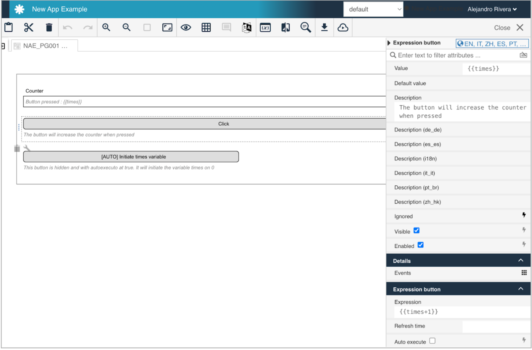
The following example shows a textfield that shows the value of a variable called times.
The logic of the form is to implement a counter.
The first button is an expression button that lets the user increase the counter when clicking.
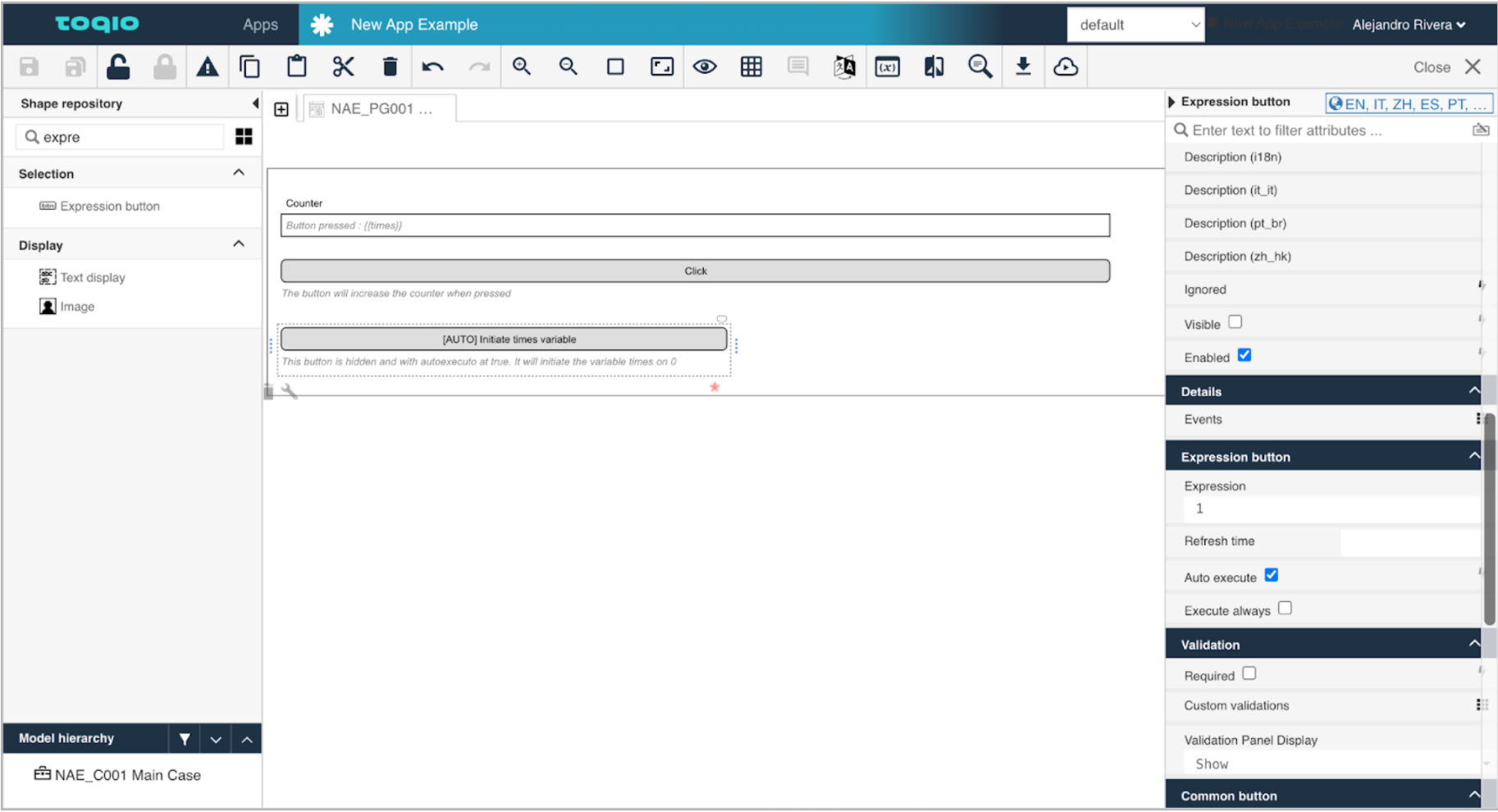
The second button is a hidden expression button with autoexecute that initiates the variable to 0.
Expression button 1 configuration
Expression button 2 configuration (auto execute)
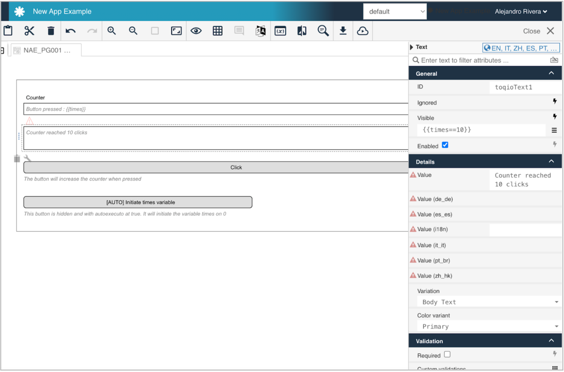
Changing the value of the variables, we can make a dynamic render based on the value of the variables by setting a conditional expression on the visible field of any component by clicking on the expression icon:
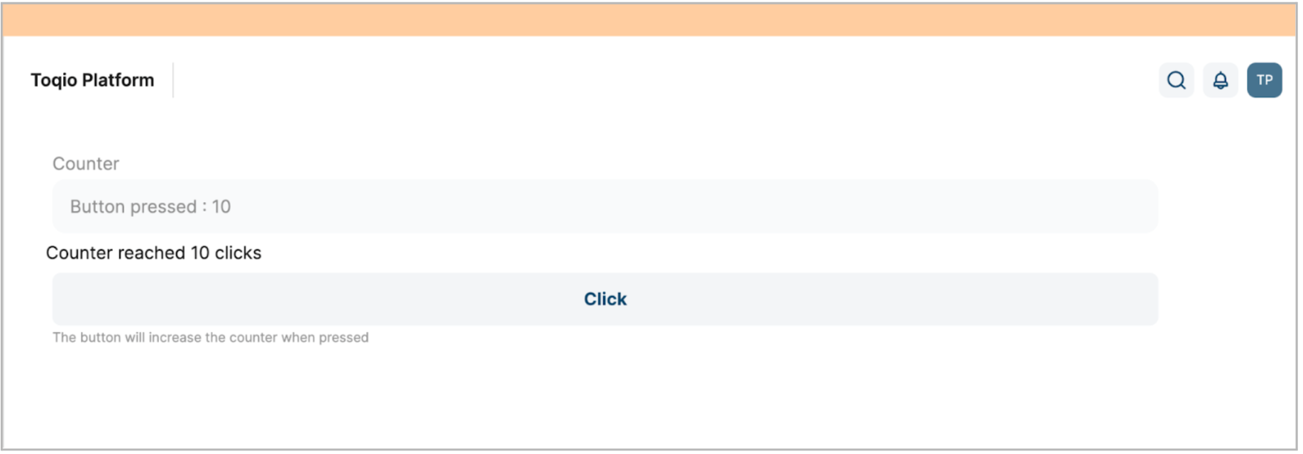
This is what the example will look like after clicking the button 10 times:
Buttons (navigation)
A button component is a simple button that redirects to a web location when clicked, with a hard refresh of the page.
Main attributes
| Attribute | Type | Description | Category |
|---|---|---|---|
| Model ID | String | This is a unique id for the component. | Every field on a form model needs a unique ID, which is automatically generated but can be changed if needed (e.g. to reference in expressions or for debugging purposes). If the field type supports rendering a label, and most types do, it can be configured here. This label is displayed on the form to the end user and typically indicates what value is expected in the field. The documentation property holds free-form text that can be used to give more details about this link button, like its purpose, usage in other models, etc. |
| Label | Text | The label attribute adds a label to the component. | |
| Label position | Selection: Left Right | The position of the label, you can choose between left or top. | |
| Label tooltip | Text | When it is defined, a question mark icon will appear in the component label. When the user hovers over it it will show this text in a tooltip. | |
| Documentation | Multiline text | A free-form text to explain the use cases for this form field. | |
| Button text | Text | Text that appears inside the button. | The purpose of a form is to either display some value or to have users provide values for the various fields of a form. In both situations, this value needs to be bound to an identifier using the {{myValue}} notation, and the value provided by the user will be stored in a variable with that identifier. If there already was a value bound to the identifier before, for example because another form had a field bound to the same identifier, it will be displayed. |
| Button alignment | Selection: Left Right | Where the button will be aligned. | Configuration properties for how the button is rendered on the form. |
| Tooltip | Text | When the user hovers the button it will show this text in a tooltip. | |
| Primary | Boolean | Mark the button as primary. | |
| Icon URL | Text | The URL of the icon to show. | Configuration properties for how the icon for the button is rendered on the form. |
| Navigation URL | Text | Specify the URL to navigate to, might be an absolute value (for example, <http://www.workflows.com>) or a relative URL (for example, '#/work/mine'). The link might also contain expressions (e.g., \#/work/all/process/{{myProcessId}}). | |
| Font Awesome icon name | Text | The icon name to be used for the button icon from Font Awesome. | |
| Icon alignment | Selection: Left Right | The alignment of the icon. | |
| Description | Text | The description attribute adds a description to the component. | Some field types have an extra line of text displayed to give the user more details about the field. |
| Ignored | Boolean | If true the component will be hidden and the value will not be part of any payload. | Fields can also be shown or hidden based on the visible condition. This can be a front end expression in the form of {{myExpression}} which can reference other form field values by their IDs. Fields can also be enabled or disabled, and similarly this can be made dynamic based on a front end expression. Some field types can be ignored (the property is shown here if that's the case), which means that its value won't be taken into account. |
| Visible | Boolean | Boolean value or expression specifies whether the component is visible or hidden. This expression might include another value in the same form, for instance use a checkbox bound to **{{showAdditionalFields}}** and use the very same expression as the visible attribute to show or hide the component according to the checked state of the checkbox. If you only want to show the component, if the form is not used as the init-form, you can use the expression **{{root.id}}** which evaluates to true only, if there is a current case id which is not the case in an initialization form. | |
| Enabled | Boolean | Boolean value or expression specifies whether a component is enabled or disabled. | |
| Style class | Text | Stylesheet class name. Add any style classes to be applied to the component for the desired styling and rendering. | The script button can get customized CSS classes to customize the default styling. Note that the CSS files needed for the customizations must be available on the runtime system. |
Example
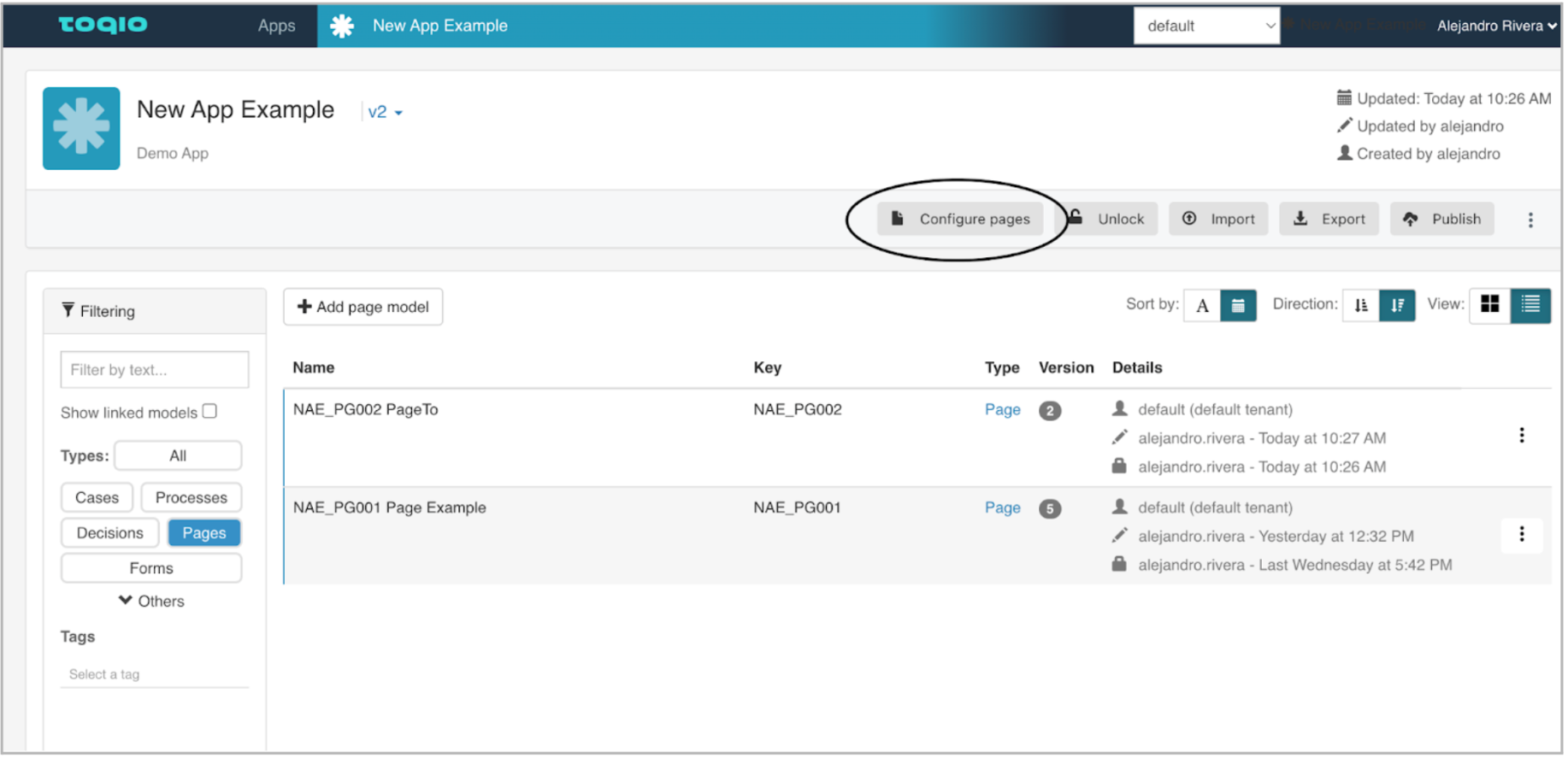
In this example, we will have two pages in an app.
By default, the app will render the first app located in the “Configure Pages” tab in Toqio Workflow Design.
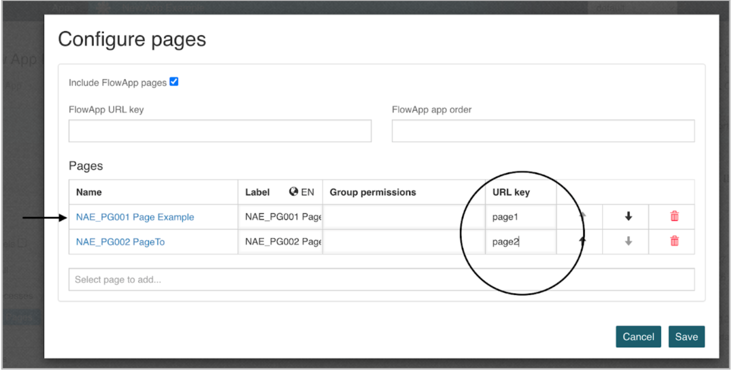
A name for the path of the url of each page can be set and modified. The first page will be the one that is shown by default when the app gets rendered.
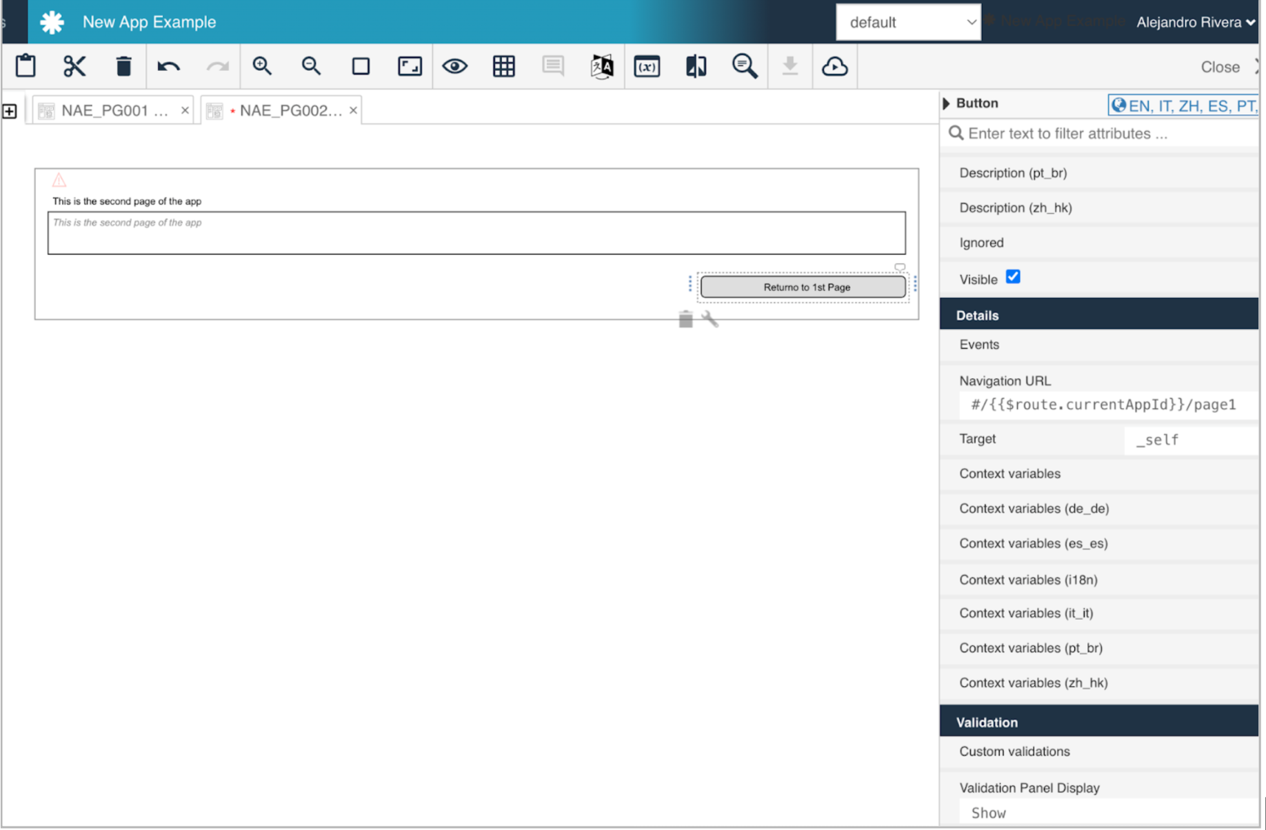
Let’s add a button to Page 1 that redirects to Page 2. Also, on Page 2, we can add a button to return to Page 1. To do that, we can use the base URL of the app that can be accessed by this expression: #/{{$route.currentAppId}}
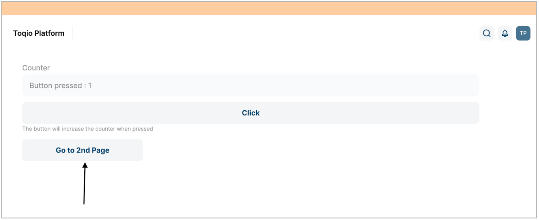
This is how it looks in the E2E:
After selecting the button, we are redirected to Page 2:

The link component performs the same behaviour but with the aspect of a link instead of a button.
Rest button
A rest button is another type of button that lets us make queries to an HTTP endpoint and stores the response. You can use it to get values from the server manually or automatically. The main use of the rest button is for launching a process instance or querying a data object.
We can create a process instance by configuring the rest button as a post method, and requesting the process instance API: **{{endpoints.process}}/runtime/process-instances**
The result will be stored in the variable we set in the value property (variable expression) of the button accessing the path is configured in the response data path property (string).
In the send request attributes property, we can define the process we want to launch by adding the attribute “processDefinitionKey” and the value will be the key of the process we want to start.
We can also send a property called “variables” with a JSON in the values of the variables we want to send to the process in this format (name, type, value):
{{flw.JSON.parse(
'[{"name":"variable1","type":"string","value":"'+flw.JSON.stringify(var1)+'"}
,{"var2":"accessToken","type":"json","value":"'+var2+'"}]'
)
}}
We can configure the button with autoexecute as true so it will start a process when the form is rendered or based on conditions.
Main attributes
| Attribute | Type | Description | Category |
|---|---|---|---|
| Model ID | String | This is a unique ID for the component. | Every field on a form model needs a unique ID, which is automatically generated but can be changed if needed (e.g. to reference in expressions or for debugging purposes). If the field type supports rendering a label, and most types do, it can be configured here. This label is displayed on the form to the end user and typically indicates what value is expected in the field. The documentation property holds free-form text that can be used to give more details about this script button, like its purpose, usage in other models, etc. |
| Label | Text | The label attribute adds a label to the component. | |
| Label position | Selection: Left Right | The position of the label, you can choose between left or top. | |
| Label tooltip | Text | When it is defined, a question mark icon will appear in the component label. When the user hovers over it, it will show this text in a tooltip. | |
| Documentation | Multiline text | A free-form text to explain the use cases for this form field. | |
| Value | Text | The binding for the form field. Use an appropriate expression to bind the component to its value and specify where the value is written/read. For example, use **{{myVariableName}}** to store the value of the field in a variable named “myVariableName”. Use prefixes to define the scope of the value, for example, “root.” for referencing the root case/process to store the value in. Please refer to the section Front end expressions in the Toqio Workflow Design guide for more information. | The purpose of a form is to either display some value or to have users provide values for the various fields of a form. In both situations, this value needs to be bound to an identifier using the {{myValue}} notation, and the value provided by the user will be stored in a variable with that identifier. If there already was a value bound to the identifier before, for example because another form had a field bound to the same identifier, it will be displayed. |
| Button text | Text | Text that appears inside the button. | |
| Expression | Text | The expression which will be executed to save the result into button value. | The script that is associated with the script button. These scripts are very powerful, but take into account the logic contained within needs to be tested and maintained, like any other software artefact. |
| Refresh time | Text | Timer, set in milliseconds, to execute the script automatically. | |
| Auto execute | Boolean | Auto execute button when rendered. | |
| Execute always | Boolean | Auto execute button when rendered even if disabled. | |
| Button alignment | Selection: Left Right | Where the button will be aligned. | Configuration properties for how the script button is rendered on the form. |
| Tooltip | Text | When the user hovers the button it will show this text in a tooltip. | |
| Primary | Boolean | Mark the button as primary. | |
| Icon URL | Text | The URL of the icon to show. | Configuration properties for how the icon for the script button is rendered on the form. |
| Font Awesome icon name | Text | The icon name to be used for the button icon from Font Awesome. | |
| Icon alignment | Selection: Left Right | The alignment of the icon. | |
| Description | Text | The description attribute adds a description to the component. | Some field types have an extra line of text displayed to give the user more details about the field. |
| Ignored | Boolean | If true the component will be hidden and the value will not be part of any payload. | Fields can also be shown or hidden based on the visible condition. This can be a front end expression in the form of {{myExpression}} which can reference other form field values by their IDs. Fields can also be enabled or disabled, and similarly this can be made dynamic based on a front end expression. Some field types can be ignored (the property is shown here if that's the case), which means that its value won't be taken into account. |
| Visible | Boolean | Boolean value or expression specifies whether the component is visible or hidden. This expression might include another value in the same form, for instance use a checkbox bound to {{showAdditionalFields}} and use the very same expression as the visible attribute to show or hide the component according to the checked state of the checkbox. If you want to only show the component, if the form is not used as the init-form, you can use the expression {{root.id}} which evaluates to true only, if there is a current case id which is not the case in an initialization form. | |
| Enabled | Boolean | Boolean value or expression specifies whether a component is enabled or disabled. | |
| Style class | Text | Stylesheet class name. Add any style classes to be applied to the component for the desired styling and rendering. | The script button can get customized CSS classes to customize the default styling. Note that the CSS files needed for the customizations must be available on the runtime system. |
Example
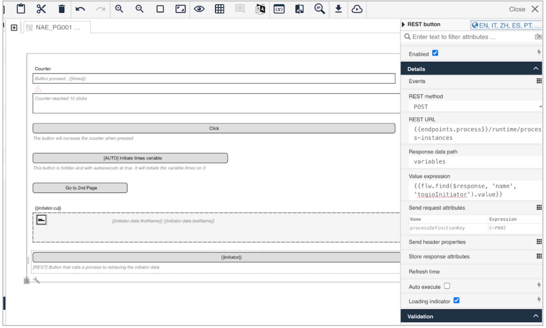
For this example, we will configure a rest button as a process starter. To do this, we will set the method as a POST pointing to the process API URL.
We configure the process that will be started by adding the key of the process with the property “processDefinitioKey” as a send request attribute.
In the response, we will access the path variable to collect the variables of the process.
We can keep just the initiator variable by looking for it in the response by adding the find function in this value expression: **{{flw.find($response, 'name', 'toqioInitiator').value}}**.
The value of the response will be stored in the variable **{{initiator}}**.
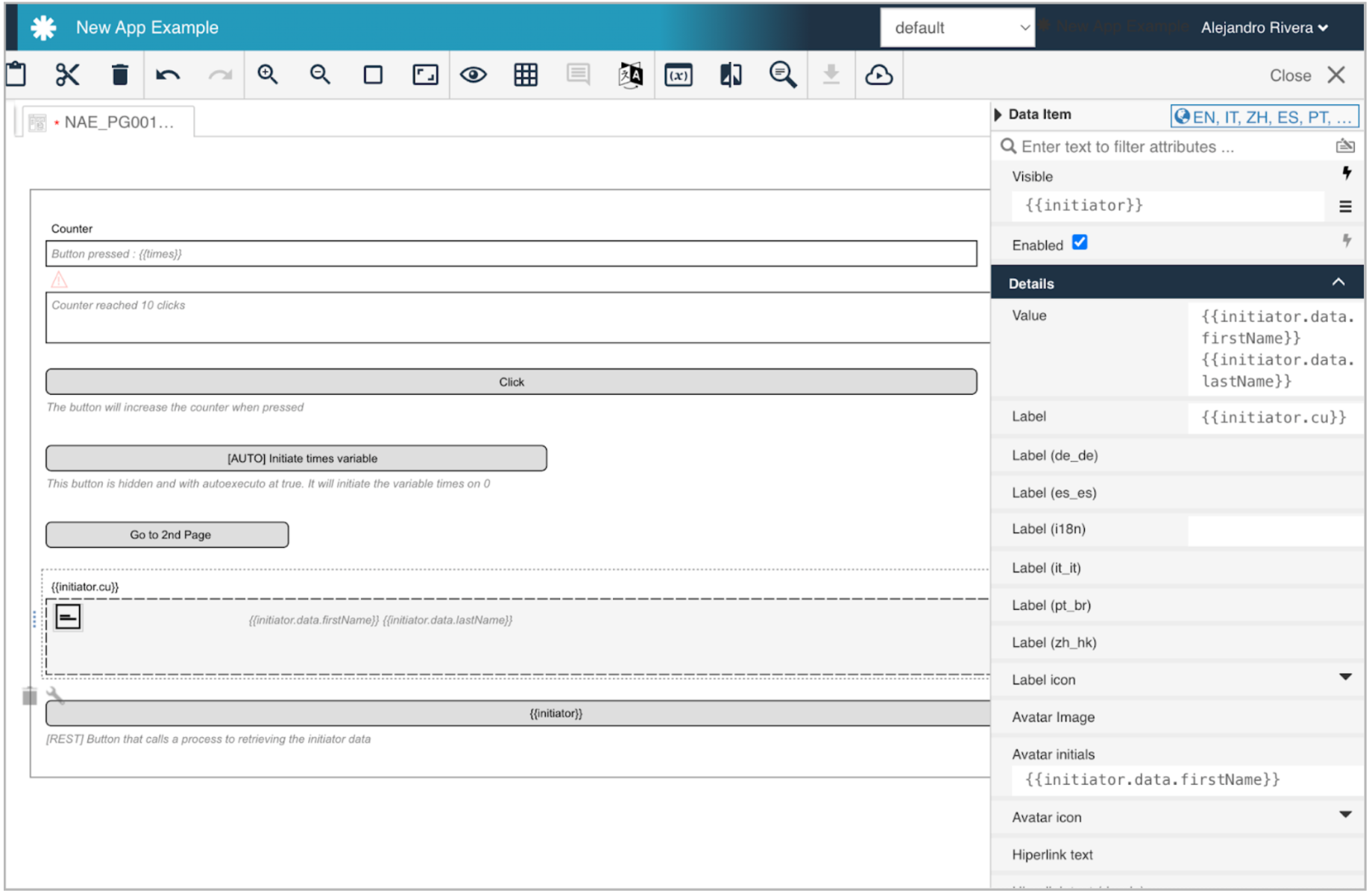
We can define a custom data item component with the values FirstName, LastName, and Customer that will be retrieved from the response of the process call, and setting it’s visibility depending on the variable **{{initiator}}**, so it will be visible just when the button is clicked.
The result:
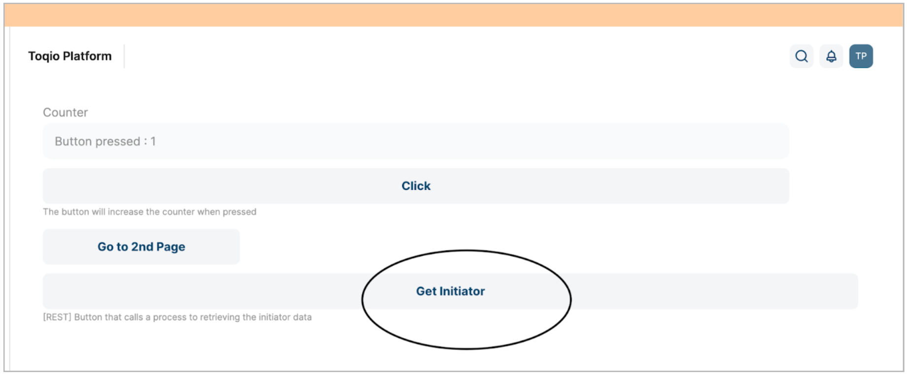
After selecting the button:

Subforms
Use a subform when you want to:
- Reuse components in different places.
- Organize code or components visually on the form/page design.
- Edit a list of elements of the same type (multiple entries set to true). This functions the same way as a forEach to display or render data based on a list.
Specific expressions
| Attribute | Type | Description |
|---|---|---|
| $itemParent | generic | Access parent scope of the component. |
| $index | number | Returns a number (starting from zero) for each subform instance. |
Main attributes
| Attribute | Type | Description | Category |
|---|---|---|---|
| Model Id | String | This is a unique id for the component. | Every field on a form model needs a unique ID, which is automatically generated but can be changed if needed (e.g. to reference in expressions or for debugging purposes). If the field type supports rendering a label, and most types do, it can be configured here. This label is displayed on the form to the end user and typically indicates what value is expected in the field. The documentation property holds free-form text that can be used to give more details about this subform, like its purpose, usage in other models, etc. |
| Label | Text | The label attribute adds a label to the component. | |
| Label tooltip | Text | When it is defined, a question mark icon will appear in the component label. When the user hovers over it it will show this text in a tooltip. | |
| Documentation | Multiline text | A free-form text to explain the use cases for this form field. | |
| Store subform data in a single variable | CheckToInput | The binding for the form field. Use an appropriate expression to bind the component to its value and specify where the value is written/read. For example, use **{{myVariableName}}** to store the value of the field in a variable named “myVariableName”. Use prefixes to define the scope of the value, for example, 'root.' for referencing the root case/process to store the value in. | If the Store subform data in a single variable flag is not checked the field values will be stored as-is. For example, if the field ID of a field in the subform is myField, the value will be stored on the parent form as myField. However, if the Store subform data in a single variable flag is checked, the field values will be stored in a JSON variable with the configured name. For example, if the subform has a subform X with two fields A and B, on the parent form there will be one JSON variable bound to X, with two fields, A and B. When the flag is checked, this will enable the option to have multiple entries. If so, the JSON variable will become an array that contains one element for each of the subform instances created at runtime. |
| Form reference | Reference | The referenced form to be used as a subform. You can either select a form reference directly (static) or even use an expression in order to dynamically specify the subform to be used during runtime. | Create or link a form for the subform. At runtime, the form will be rendered on the location of the subform. A form reference can be unlinked to allow another form to be linked in its place. Note that unlinking a form does not delete the form model itself. |
| Show border | Boolean | If true, the subform renders a border around the list of elements in it. | customize how the subform is displayed to the user. |
| Collapsible | Boolean | If true, the subform can be collapsed/expanded by clicking on an arrow. | |
| Initially collapsed | Boolean | If true, the subform will be initially rendered as collapsed. | |
| Multiple elements | Boolean | If multiple elements are set to 'true', the subform can hold more than one entry and the variable the subform is bound to will contain a list of maps holding the data shown in the subforms. Set multiple elements to “false”, if there should only be one subform shown and the variable the subform is bound to will hold a map rather than a list of maps. | When binding the subform to a single variable, it's possible to allow the user to add multiple instances of the subform at runtime. If so, the field values of each subform will be stored in a JSON array, with one element in the array for each subform. Additionally, whether or not addition, deletion or reordering is allowed, can be changed by checking or unchecking the flags on the left. |
| Show add button | Boolean | When multiple entries are true, it will show or hide the add button. | |
| Add button text | Text | Add button text. | |
| Show remove button | Boolean | When multiple entries are true, it will show or hide the delete button. | |
| Delete confirmation | Boolean | Displays a message asking for confirmation to delete a subform element. | |
| Reorder elements | Boolean | Allows you to change the order of the elements of a subform. | |
| Instance unique key mapping (expression) | Text | Map Subform instances with unique keys to be able to identify a specific instance of the multi subform. (e.g. **{{$item.id}}**). | |
| Show no items message | Boolean | When there are no items, it will show or hide the no items message. | Customize the message shown to the user when there are no subforms added yet. |
| No items message | Text | Message to display when there are no items. | |
| Ignored | Boolean | If true the component will be hidden and the value will not be part of any payload. | Fields can also be shown or hidden based on the visible condition. This can be a front end expression in the form of {{myExpression}} which can reference other form field values by their IDs. Fields can also be enabled or disabled, and similarly this can be made dynamic based on a front end expression. Some field types can be ignored (the property is shown here if that's the case), which means that its value won't be taken into account. |
| Visible | Boolean | Boolean value or expression specifies whether the component is visible or hidden. This expression might include another value in the same form, for instance use a checkbox bound to {{showAdditionalFields}} and use the very same expression as the visible attribute to show or hide the component according to the checked state of the checkbox. If you want to only show the component, if the form is not used as the init-form, you can use the expression **{{root.id}}** which evaluates to true only, if there is a current case id which is not the case in an initialization form. | |
| Enabled | Boolean | Boolean value or expression specifies whether a component is enabled or disabled. | |
| Style class | Text | Stylesheet class name. Add any style classes to be applied to the component for the desired styling and rendering. | The subform can get customized CSS classes to customize the default styling. Note that the CSS files needed for the customizations must be available on the runtime system. |
Example
In the following example, we will use a demo app called “Delivery App”.

This app is just a register form that also lets the user auto-generate the values of the form query using a random web API. There is a list of generated users where those users can be added or removed.
The list part of the form is built with a subform linked to the list of users, so every time the list increases, we will see the same thing that the list component sees.
This is how the form would look if the fields were to be modified:
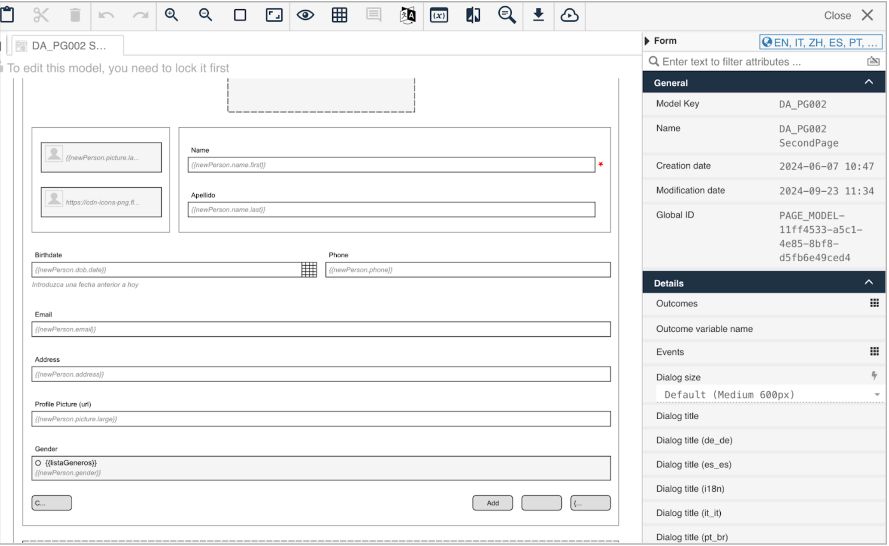
We have configured a rest button that starts a process with the random icon. This process will call an API that generates random people. This data will be mapped with the properties of a “new Person item”.
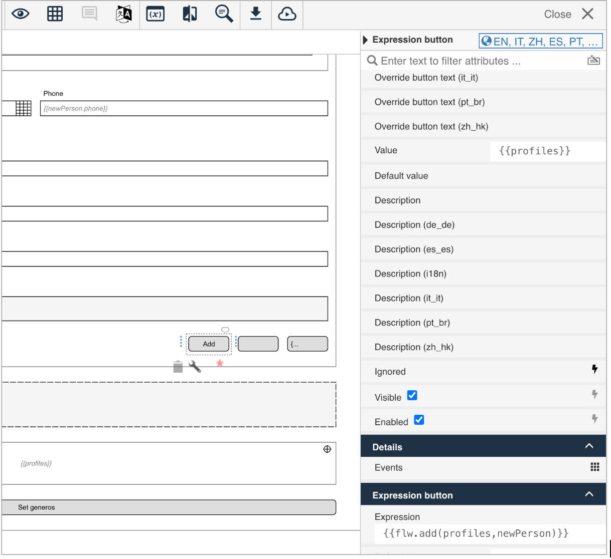
We also have an expression button that adds the newPersonItem to the list of profiles:
We have created a simple form that contains a data item with the properties of the new person item values, and a separator.
This is the model form that we will use as a subform, so by linking the variable of the profiles to it we can render the subform based on each entry of the list (based on each person).
It winds up looking like this:
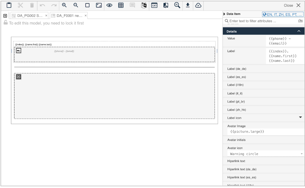
The variable must contain the same name as the properties of the parent variable as in this data example:
"profiles": [
    {
      "gender": "male",
      "name": {
        "title": "Mr",
        "first": "Héctor",
        "last": "Santana"
      },
      "location": {
        "street": {
          "number": 7575,
          "name": "Calle del Barquillo"
        },
        "city": "Cartagena",
        "state": "País Vasco",
        "country": "Spain",
        "postcode": 15847,
        "coordinates": {
          "latitude": "50.6963",
          "longitude": "-112.5687"
        },
        "timezone": {
          "offset": "0:00",
          "description": "Western Europe Time, London, Lisbon, Casablanca"
        }
      },
      "email": "[email protected]",
      "login": {
        "uuid": "7d7cc2e1-a3a5-495a-87f6-ecf5139238e7",
        "username": "yellowgorilla888",
        "password": "invest",
        "salt": "PmPvLuNq",
        "md5": "93ba714ddf556414bf6f2fe6d39676c4",
        "sha1": "c9c9231128b4adc2d5c7bf5c63daa76601e1d404",
        "sha256": "f5a56a9796f31e161e3543b3c0bf4831dacc9d650c890cdff42a3309d64f1c2d"
      },
      "dob": {
        "date": "1990-02-25",
        "age": 34
      },
      "registered": {
        "date": "2021-08-09T08:24:58.932Z",
        "age": 3
      },
      "phone": "901-512-594",
      "cell": "601-107-781",
      "id": {
        "name": "DNI",
        "value": "48991434-M"
      },
      "picture": {
        "large": "https://randomuser.me/api/portraits/men/31.jpg",
        "medium": "https://randomuser.me/api/portraits/med/men/31.jpg",
        "thumbnail": "https://randomuser.me/api/portraits/thumb/men/31.jpg"
      },
      "nat": "ES",
      "address": "Calle del Barquillo 7575, Cartagena"
    },
    {
      "gender": "female",
      "name": {
        "title": "Ms",
        "first": "Beatriz",
        "last": "Ramírez"
      },
      "location": {
        "street": {
          "number": 647,
          "name": "Calle de Arganzuela"
        },
        "city": "Parla",
        "state": "Galicia",
        "country": "Spain",
        "postcode": 42147,
        "coordinates": {
          "latitude": "18.2694",
          "longitude": "56.4883"
        },
        "timezone": {
          "offset": "-8:00",
          "description": "Pacific Time (US & Canada)"
        }
      },
      "email": "[email protected]",
      "login": {
        "uuid": "2bb215aa-5cfa-4ad7-9264-d868f6e4040e",
        "username": "crazysnake575",
        "password": "gustav",
        "salt": "V0NO2Cfj",
        "md5": "106d7d713ad91d5c84a3e9557c46076d",
        "sha1": "3f2cc08aa94eeaed3c6c0adf50ada8d153e99f83",
        "sha256": "6b438613ffc64124021af4a4e4d2080ebef2205a5f096c2f2f7bc1ad5787b1e8"
      },
      "dob": {
        "date": "1968-01-05",
        "age": 56
      },
      "registered": {
        "date": "2013-05-25T04:32:50.490Z",
        "age": 11
      },
      "phone": "938-202-095",
      "cell": "695-046-733",
      "id": {
        "name": "DNI",
        "value": "46161799-J"
      },
      "picture": {
        "large": "https://randomuser.me/api/portraits/women/92.jpg",
        "medium": "https://randomuser.me/api/portraits/med/women/92.jpg",
        "thumbnail": "https://randomuser.me/api/portraits/thumb/women/92.jpg"
      },
      "nat": "ES",
      "address": "Calle de Arganzuela 647, Parla"
    }
  ]
Lastly, we need to configure the subform with the variable that contains the list, **{{profiles}}**, with the multiple elements checkbox set to true, and the linked form reference:
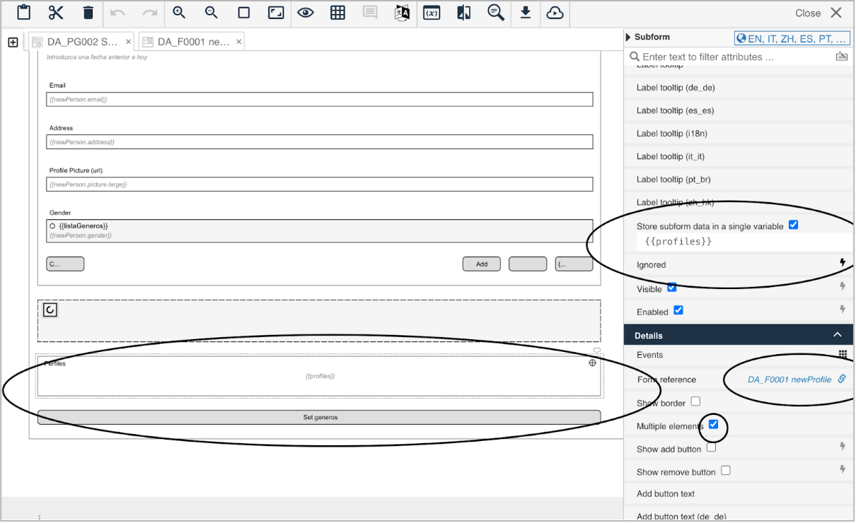
This is how the app looks after calling the API several times to retrieve a random profile and adding them to the list:
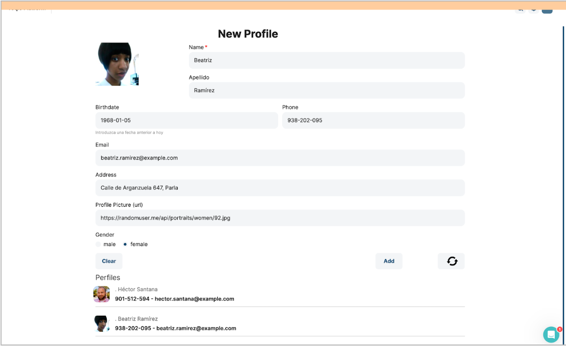
Updated about 1 year ago
