Information Box
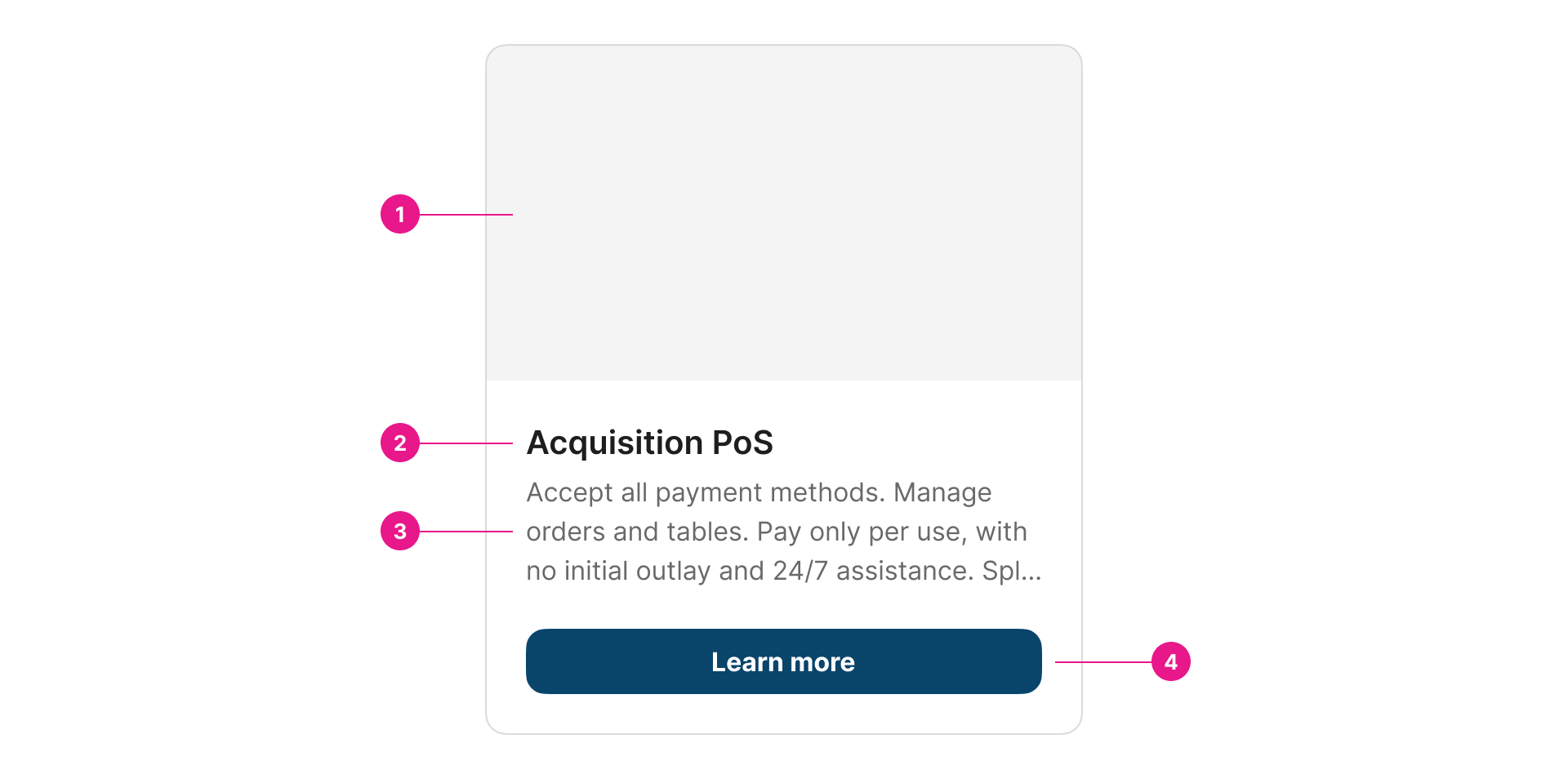
An information box is used to display different elements that include a visual and textual explanation, along with the option to visit another page for more information.

Properties
Value "expression" | required
The binding for the component. Use an appropriate expression to bind the component to its value and specify where the value is saved/read.
For example, use
'{{myVariableName}}'to store the value of the component in a variable named'myVariableName'
Use prefixes to define the scope of the value.
For example,
'root.'for referencing the root case to store the value in or'parent.'to store the value in the parent work item of the current one.
Please refer to the section 'Frontend expressions' in the Flowable guide for more information.
Expression "string", "variable", "expression"
The expression which will be executed to save the result into the button value.
Label "string", "variable", "expression" | required | multilanguage
The label attribute adds a short piece of text to the component.
Description "string", "variable", "expression" | required | multilanguage
The description attribute adds a longer, more explanatory piece of text to the component.
Number of description lines "number"
This will fit the height of the description text to the amount of lines set. If the description text exceeds the available space, it will be truncated. If you have a shorter description, the empty space will be preserved to ensure consistency among occurrences.
Image URL "string", "variable", "expression"
The link to the image you wish to display.
Fit image to the box "boolean"
Indicates whether the image should be framed to the edges of the box or should be encased within a frame inside the box.
Status value "string", "variable", "expression"
Value to identify the status of the box.
Status mapping "table"
Map the status value with the corresponding status variant and label.
| Name | Type | Description |
|---|---|---|
| Status value | "string", "variable", "expression" | Value to match with the component status value. |
| Status label | "string" | multilanguage | Label for the value. |
| Status variant | "ENUM ("success", “info”, “warning”, “danger”, “neutral”, “grey blue”, “vermilion”, “orange”, “grass”, “brownie”, “sky”, “purple”)" | Variant for the value. |
Button text "string", "variable", "expression" | multilanguage
Replace the default action button text with this (leave blank to use default action name).
Info row title "string", "variable", "expression" |multilanguage\
Add extra text to be included at the bottom of the component, on a first line, left hand side, in bold.
Info row subtitle "string", "variable", "expression" |multilanguage\
Add extra text to be included at the bottom of the component, on a second line, left hand side, in bold.
Info row right label "string", "variable", "expression" |multilanguage\
Add extra text to be included at the bottom of the component, on a first line, right hand side, in bold.
Info row right sublabel "string", "variable", "expression" |multilanguage\
Add extra text to be included at the bottom of the component, on a second line, right hand side, in bold.
Margin top "number"
Add space equivalent to the number of indicated pixels to the top margin.
Margin bottom "number"
Add space equivalent to the number of indicated pixels to the bottom margin.
Margin left "number"
Add space equivalent to the number of indicated pixels to the left margin.
Margin right "number"
Add space equivalent to the number of indicated pixels to the right margin.
Tips
This component is supposed to be used on a grid. Therefore, the description property will have a height of five (5) lines by default, so the components are not misaligned when they are shown together. This can be customized using the “Number of description lines” property.
Updated about 1 year ago
