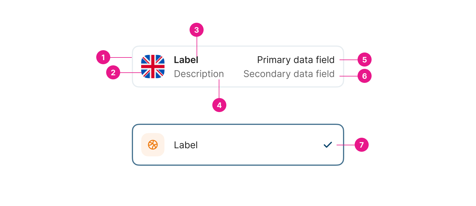
Selection box
An interactive Container that represents an entity.

Properties
Value "string" | required
The binding for the component. Use an appropriate expression to bind the component to its value and specify where the value is saved/read.
For example, use
'{{myVariableName}}'to store the value of the component in a variable named'myVariableName'.Use prefixes to define the scope of the value. For example,
'root.'for referencing the root case to store the value in or'parent.'to store the value in the parent work item of the current one.
Please refer to the section 'Frontend expressions' in the Flowable guide for more information.
Value Content string | required
Add the content of the value to be stored in the value property.
Label string | required
Add the label for the element. This can be a variable or a fixed value.
Description string
Add a description of the element. This can be a variable or a fixed value.
Data Field Top string
Add additional data aligned at the top right of the component.
Data Field Bottom string
Add additional data aligned at the bottom right of the component.
Selected boolean
Enable this option to show the box as selected if the value equals the content of the value (valueContent).
Selected Icon ENUM
Icon to display when Selected.
Avatar Image string
Variable containing the image to display.
Avatar Initials string
Takes initials from a variable or expression (up to three). If a string is added, it will take the first letter of each word. Used as a fallback if no image is found.
Avatar Icon ENUM
Select an icon for the element as a fallback if neither image nor initials are found.
Avatar icon (custom name) string
Add an existing icon name to be added to the item. This will be a fallback if the image is not found and not initials have been added.
Avatar icon color string
Avatar icon color to show with the icon for identifying easier the element.
Avatar icon background color string
Avatar icon background color to show with the icon for identifying easier the element.
Vertical Margin number
Margin in pixels to add above and below the selection box, separating it from other elements if displayed in a list.
Updated about 1 year ago
